IKEA桃園青埔店
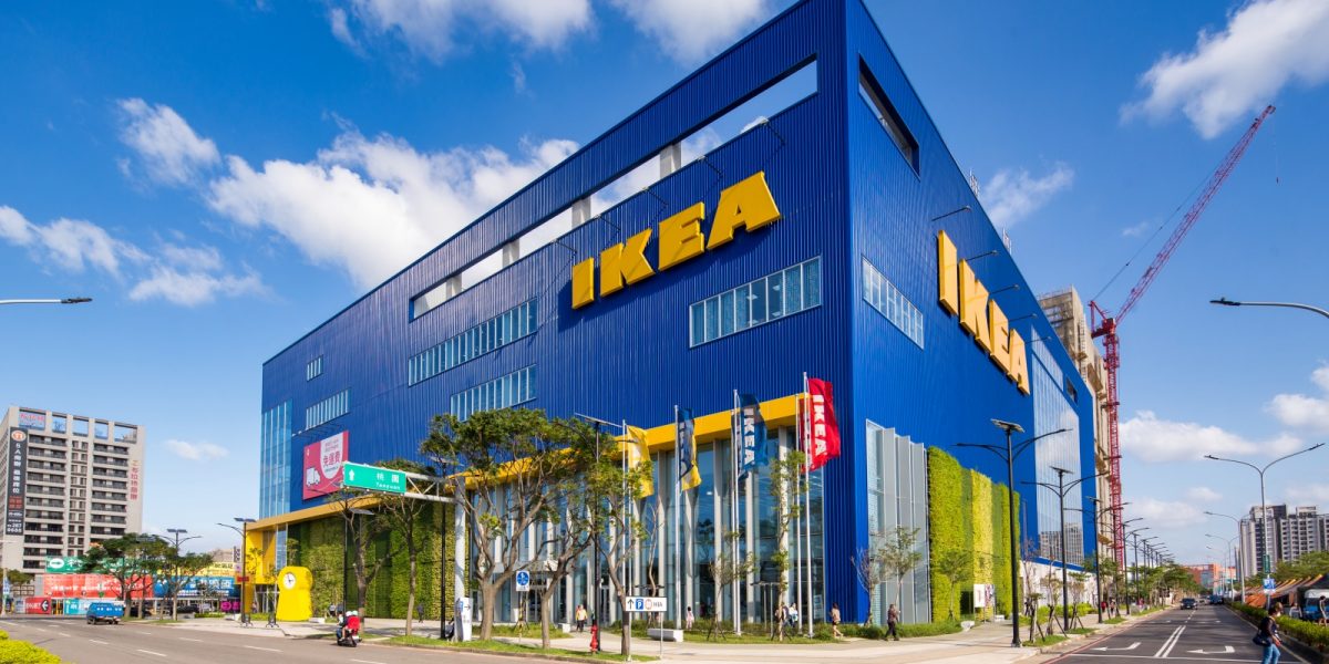
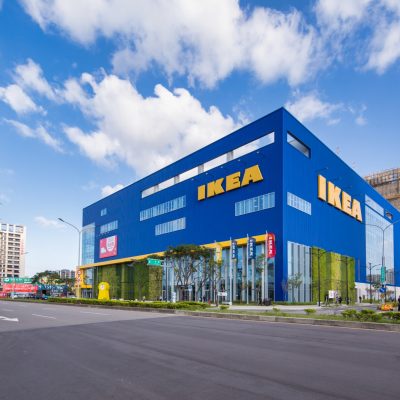
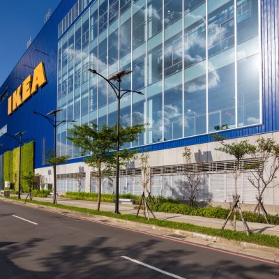
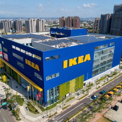
IKEA桃園青埔店,從桃園高鐵站走路約5分鐘就到達,商場為地上六層,地下三層,樓地板面積為74,596m2,於開幕後,為全台最大IKEA商場。
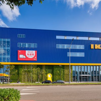
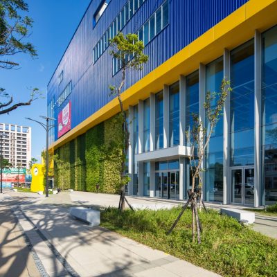
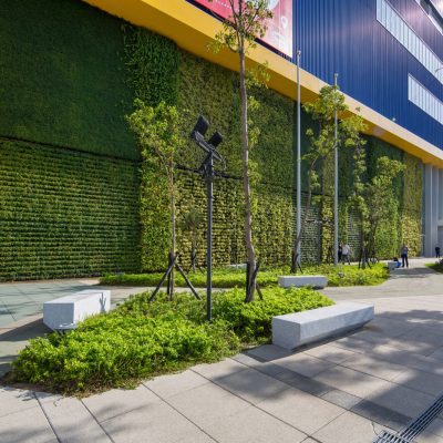
在外觀設計,延續瑞典國旗的藍黃色調,並以大面積植生牆,延伸綠意景觀,並有調和IKEA商場與周邊空間之視覺效果,使建築能與環境協調共生。
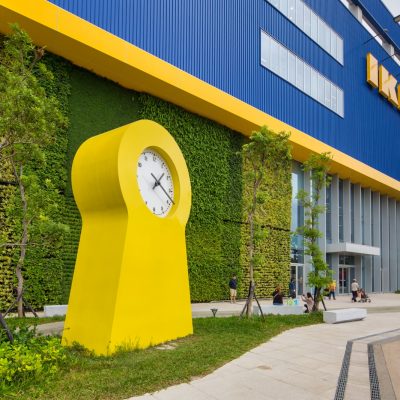
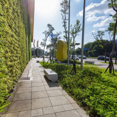
我們在入口處,以IKEA代表性商品IKEA PS 1995鐘做為入口意象,這款北歐設計經典商品,也與高鐵站內時刻表連結,建立IKEA商場與高鐵旅人之連結性,也成為商場周圍的醒目地標,成為打卡或與朋友相約的地景地標。
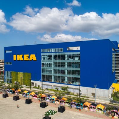
屋頂則規劃屋頂花園與綠帶,提供顧客與鄰近居民輕量運動空間,屋頂的創意廣場,能提供舉辦各式公益性與藝文性活動。
Located next to the Taiwan Taoyuan High-speed Railway Station, IKEA Taoyuan Store is a six-story shopping mall building with three floors underground. It only takes 5-minute walk from Taoyuan High-speed Railway Station. It is currently the largest IKEA shopping mall in Taiwan.
In terms of exterior appearance design, all IKEA’s appearance colors in Taiwan use the blue-yellow tone which is consistent with the Swedish flag. This is the standard specification that IKEA intends to integrate the corporate image. In order to make the Taoyuan store more business-recognizable, we used blue as the base and yellow as the embellishment, combined with a large number of windows and a large area of planted walls, to make the whole building appear conspicuous and open.
In order to make this project into an important landmark next to the high-speed rail station, we use
the large green wall on the building to matched with the outdoor landscape. We also organize an extended green space in outdoor space to provide customers and neighbors a leisure space. The green landscape can also connect the visual effects of the IKEA shopping mall and the surrounding environment. In addition, we made IKEA’s representative product IKEA PS 1995 into a large object as a front image. This large clock can not only be regarded as a public art, but also connected with the concept of time of the high-speed rail station, and established the connection between the IKEA shopping mall and high-speed rail travelers. This huge object has become a striking landmark in the mall and an important symbol as a meetup point.
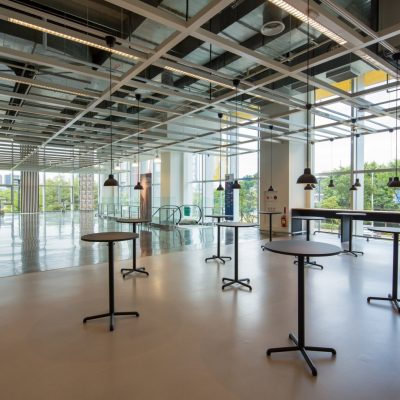
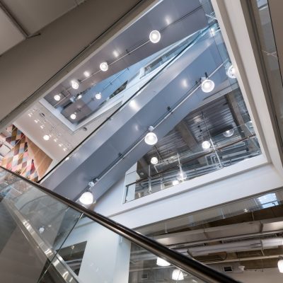
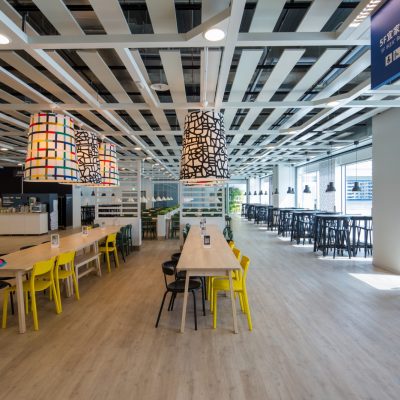
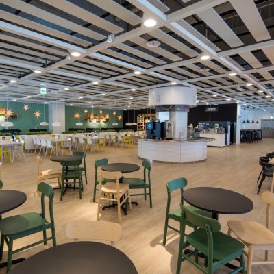
For a long time, IKEA has successfully established a one-way movement line which allows customers to browse all products clearly and completely. Therefore, how to set up this movement line become a huge consideration for each case of IKEA. In this case which is up to the sixth floor, thinking from the consumption behavior is important. In order to make the whole buying process smoothly, a flow line setting that allows customers to move from top to bottom is needed after the purchased is completed. In addition, we set the restaurant on the fifth and sixth floors with the best view, so the customers will go from upstairs down to all floors of the mall to shop.
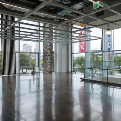
This project imports many green building concepts such as the wind and solar power equipment on the top floor, a large green walls and glass windows on the outer wall of the building. Those elements can allow sunlight to be import into the room, and reducing the use of electric lights during the day. We also set up a double wall to block heat insulation and avoid wall heat absorption and conduction into the room in the summer. It also can reduce the use of air conditioning power, and have thermal insulation effect in winter. In addition, the roof is planned with a garden space, which can also provide a space for holding a various public activities and art events.
